Kin Kimchi
Kimchi jars have looked the same for many years; they are always in glass jars with minimal design thought. They have an extensive history and look outdated among the shelves. The goal: create a modern design for an old and traditional practice.
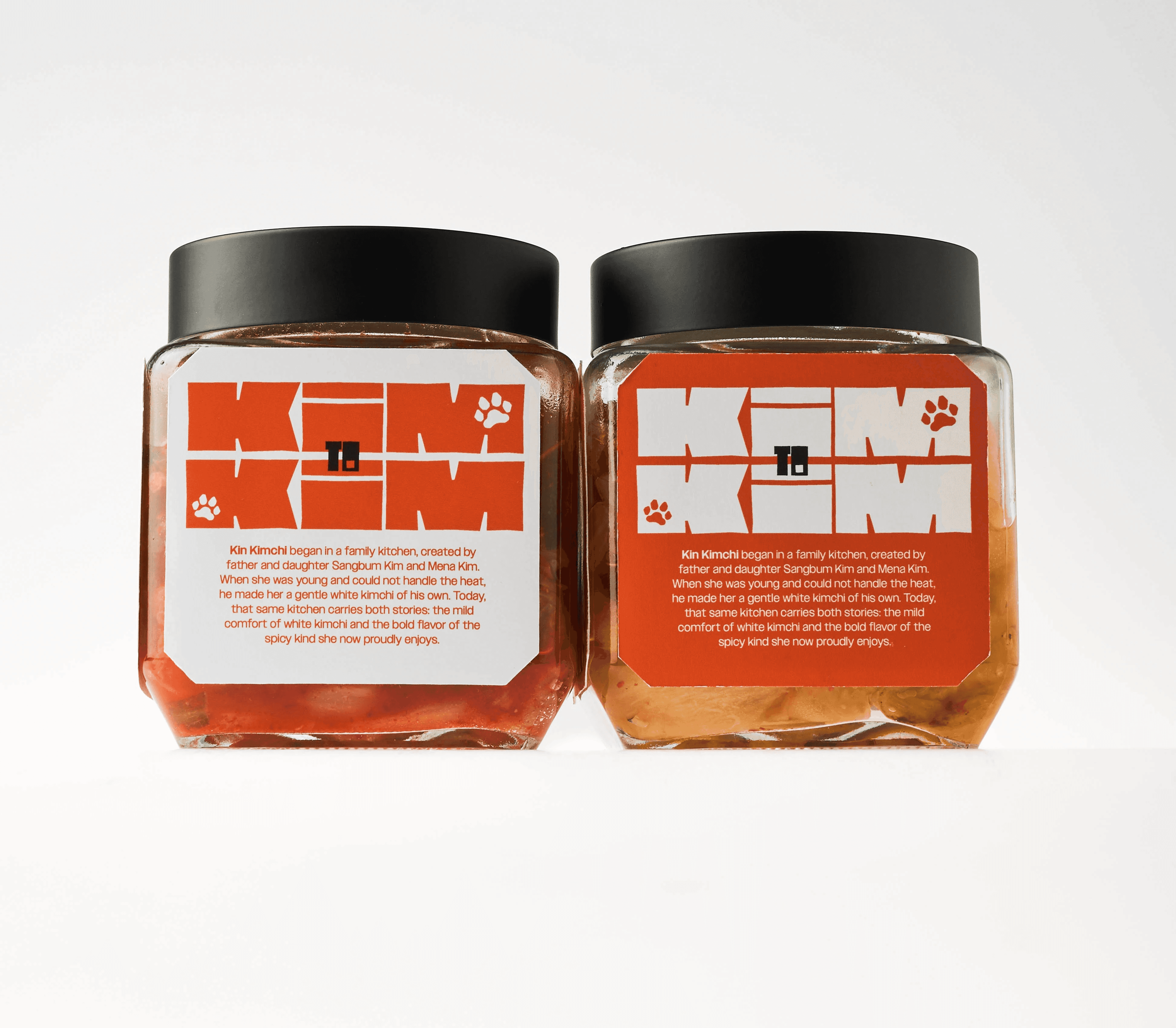
Kin Kimchi is a brand inspired by elements of Korean folklore, such as the tiger and modernizing them. It brings a new look to the kimchi jar while referencing traditional stories.
Date
2026
Client
Class Project
Team
Solo
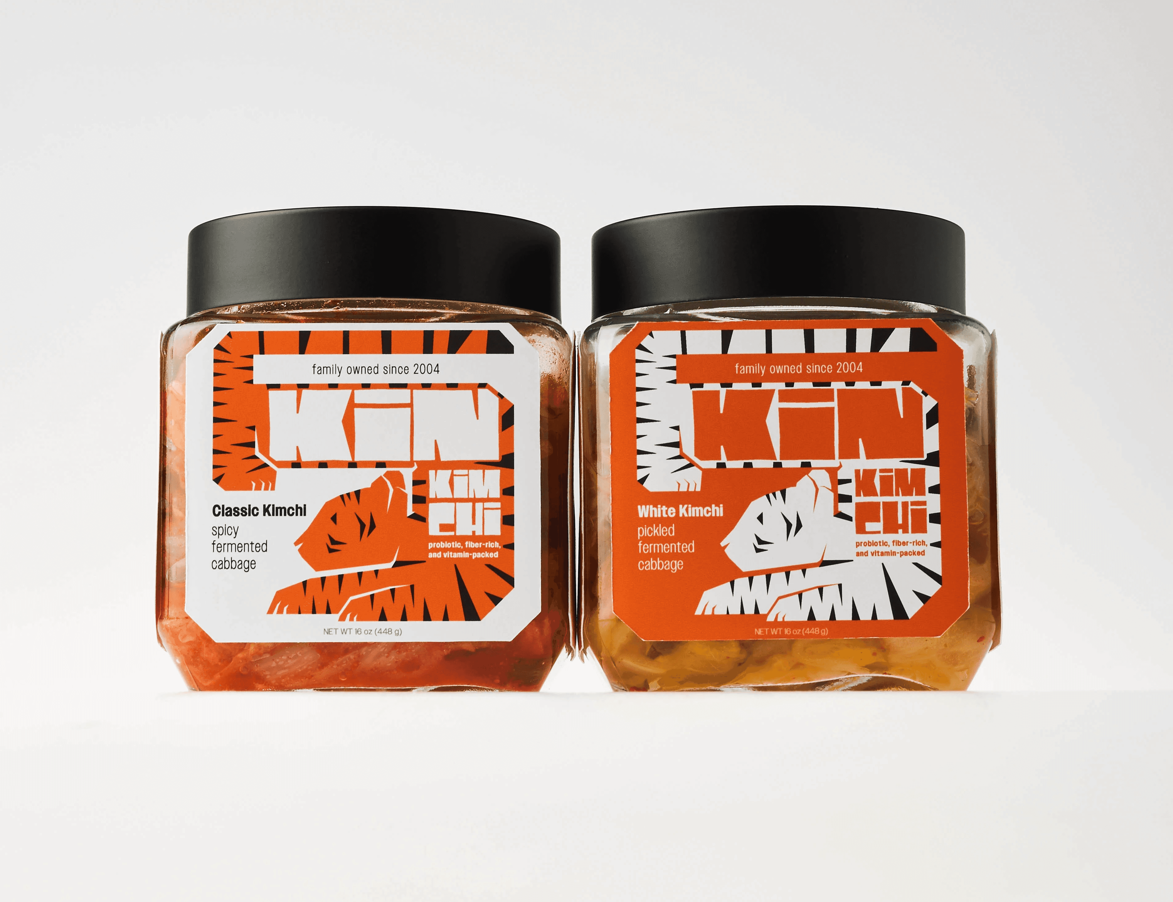
Tying into my own personal identity, I created two flavors to connect to a personal anecdote of how when growing up, I couldn’t handle the spice of kimchi, so my dad would wash it off for me. The orange tiger represents the spicy kimchi while the white tiger represents the white kimchi. Although it might get interpreted that the orange label is the spicy one, I wanted to make sure that the label will contrast with the kimchi itself in the clear jar. Kin Kimchi is an ode to my dad who cooked korean food for me and kept me connected to our culture, and since he’s a graphic designer, he inspires me everyday!